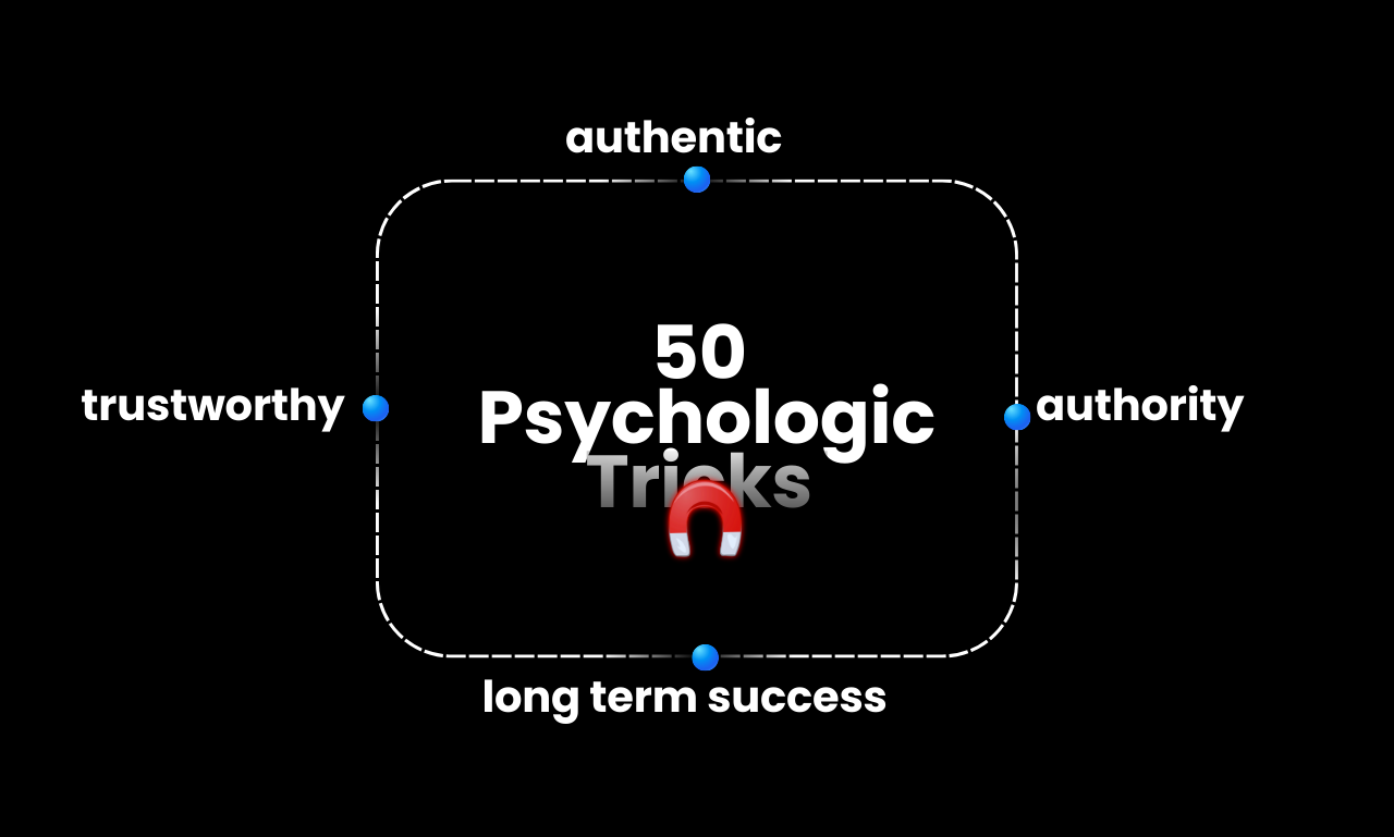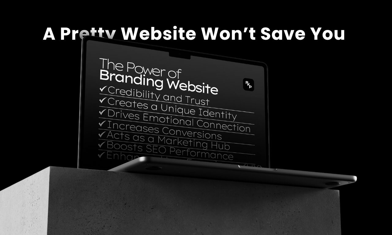
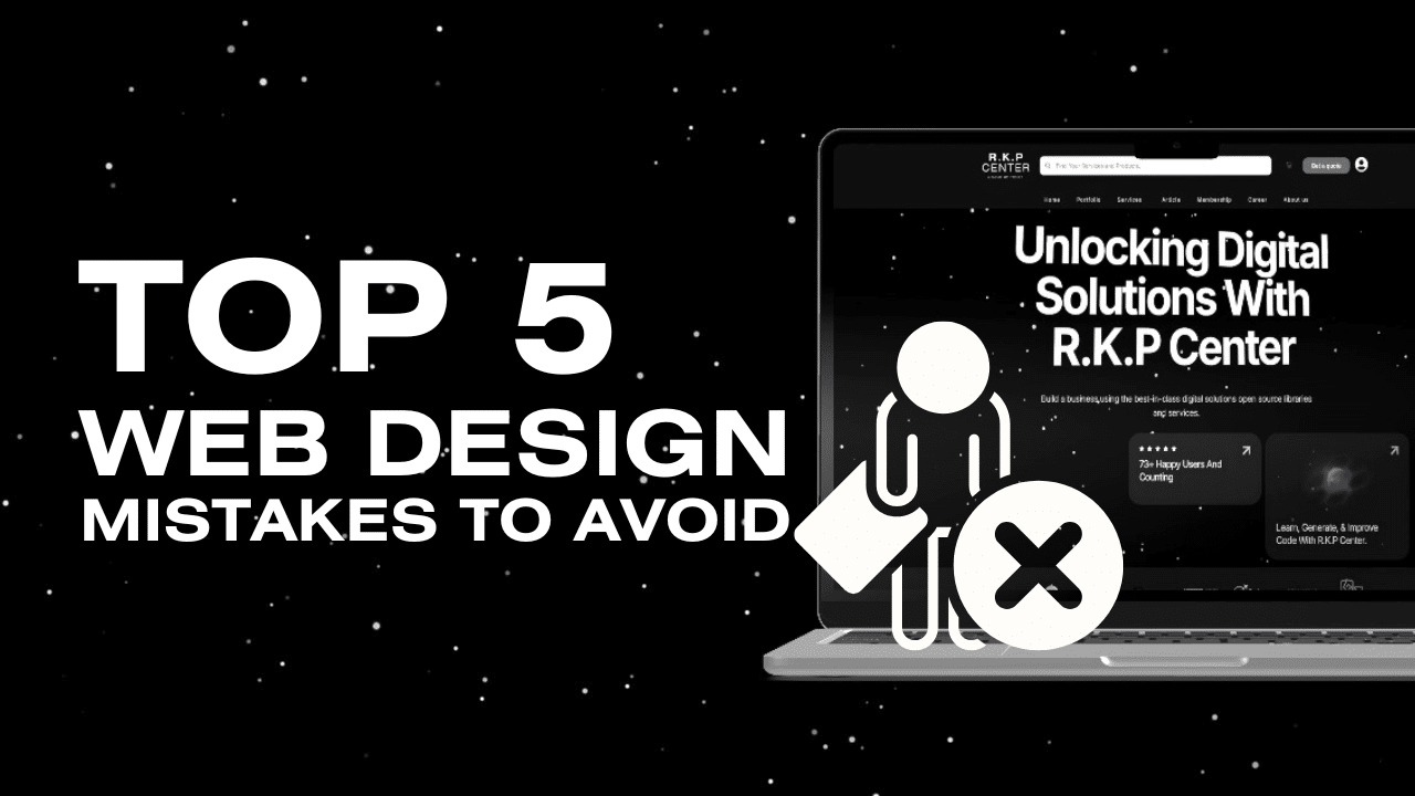
Your website is the face of your business, and it plays a crucial role in shaping your visitors’ first impressions. However, even the most well-intentioned designs can contain critical flaws that frustrate and drive users away. Let’s explore the top five web design mistakes you should avoid to keep your audience engaged and ensure your site converts visitors into loyal customers.
1. Overcomplicating the Design
“Fancy doesn’t always mean effective.”
A cluttered layout with too many elements can overwhelm users and make navigation difficult.
- Solution: Stick to a clean, minimalistic design emphasizing usability and simplicity.
- Tip: Follow design principles like white space and visual hierarchy to guide users smoothly through your website.
- Read more about Minimalist Web Design on Wikipedia.
2. Ignoring Mobile Optimization
“Over half of web traffic comes from mobile devices.”
If your website isn’t mobile-friendly, you’re likely losing a significant portion of potential customers.
- Solution: Implement responsive web design that adapts seamlessly across all screen sizes.
- Tip: Use tools like Google’s Mobile-Friendly Test to check how your website performs on mobile.
- Learn more about Responsive Web Design on Wikipedia.
3. Slow Loading Speeds
“Users won’t wait more than a few seconds for your site to load.”
A slow-loading website can result in higher bounce rates and lower search engine rankings.
- Solution:
- Optimize images by compressing them without sacrificing quality.
- Minimize the use of large files and unnecessary scripts.
- Utilize a Content Delivery Network (CDN) to reduce server response time.
- Learn about Website Performance Optimization on Wikipedia.
4. Weak or Missing Calls-to-Action (CTAs)
“Your visitors need guidance on what to do next.”
A clear and compelling CTA directs users toward taking the desired action, such as signing up, purchasing, or contacting you.
- Solution:
- Use action-oriented phrases like “Get Started,” “Join Now,” or “Download Free.”
- Ensure your CTA buttons are prominently displayed and use contrasting colors to stand out.
- Learn more about effective Call-to-Action Strategies on Wikipedia.
5. Poor Content Readability
“Long paragraphs, tiny fonts, and bad color contrast make your content hard to read.”
Users who struggle to read or understand your content are more likely to leave.
- Solution:
- Use clean, legible fonts and maintain proper line spacing.
- Stick to high-contrast color combinations for text and background.
- Break up long paragraphs into smaller, digestible chunks.
- Explore more about Typography in Web Design on Wikipedia.
Conclusion
Your website isn’t just a digital placeholder—it’s a critical tool for driving engagement and conversions. By avoiding these common mistakes, you can create a website that provides a seamless, user-friendly experience and maximizes your business growth.
Need help with professional web design?
Let’s build a website that works for your business.
👉 Get a Quote at R.K.P Center.