
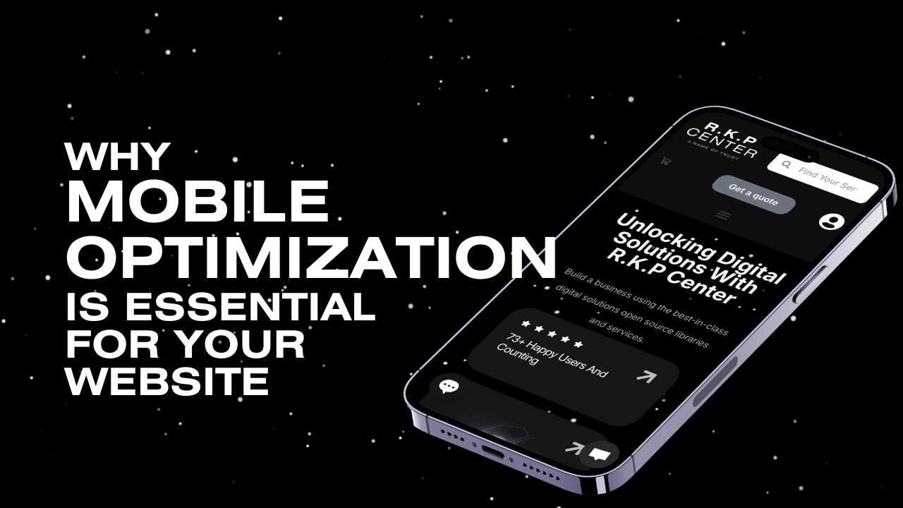
As more people access the internet via mobile devices, optimizing your website for mobile is no longer optional; it’s essential. A mobile-friendly website ensures users have a seamless experience, which is key to retaining visitors and boosting conversions.
Here’s why mobile optimization is critical for your website’s success and how to ensure your site is ready for mobile visitors.
1. Mobile Usage Is Growing Rapidly
Mobile devices now account for over 60% of global web traffic. If your website isn’t mobile-optimized, you’re likely missing out on many potential customers. Mobile users expect fast loading times, easy navigation, and an experience tailored to smaller screens.
2. Boost Your SEO with Mobile Optimization
Google’s mobile-first indexing prioritizes the mobile version of your website for search engine ranking, making mobile optimization a vital SEO factor. A mobile-optimized site enhances visibility on search engine result pages (SERPs), helping your website attract more organic traffic and rank higher.
3. Better Engagement and Higher Conversions
When visitors can easily navigate and interact with your website on their phones, they’re more likely to stay longer, engage with your content, and convert. For e-commerce sites, a mobile-friendly experience reduces cart abandonment and increases sales, directly impacting your bottom line.
4. Stay Competitive in Your Industry
If your competitors haven’t optimized their sites for mobile, you have a prime opportunity to stand out. A mobile-friendly site not only improves the user experience but also builds trust and encourages repeat visits, giving you a competitive edge in the market.
How to Optimize Your WordPress Site for Mobile
- Responsive Design: Use a responsive WordPress theme that automatically adapts to different screen sizes. Popular themes like Astra, Divi, and GeneratePress are great choices for mobile responsiveness.
- Optimize for Speed: Use caching tools like WP Rocket, optimize images with Smush or ShortPixel, and consider a content delivery network (CDN) to ensure fast loading times for mobile users.
- Clear Navigation and CTAs: Simplify your menu, make CTAs easily clickable, and prioritize mobile-friendly navigation for a smooth user experience.
- Readable Fonts and Scalable Media: Ensure that text and images are easy to view on smaller screens, without the need for zooming.
- Test Regularly: Use Google’s Mobile-Friendly Test to ensure your site meets mobile standards, and monitor performance regularly to address any issues.
Conclusion
Mobile optimization is crucial for a user-friendly experience, improved SEO, and higher conversions. By optimizing your WordPress site for mobile, you’re setting your business up for long-term success in a mobile-dominated world.
If you need assistance with mobile optimization, R.K.P Center is here to help. Contact us today to ensure your website delivers a seamless mobile experience that attracts and retains customers.
FAQs
What are the long-term benefits of maintaining a mobile-optimized website?
Maintaining a mobile-optimized website ensures a better user experience, higher search engine rankings, increased engagement, and improved conversion rates. These benefits help sustain your business’s growth and competitiveness in a mobile-driven digital landscape.
What strategic steps can I take to ensure my WordPress site is mobile-optimized?
To optimize your WordPress site for mobile, use a responsive theme, optimize site speed with caching and image tools, simplify navigation and calls to action, ensure fonts and media are easily viewable on smaller screens, and regularly test your site’s mobile-friendliness using tools like Google’s Mobile-Friendly Test.
In what ways does a mobile-friendly website enhance user engagement and conversions?
A mobile-friendly website makes navigation easier and interactions simpler, encouraging visitors to stay longer, engage with content, and make purchases. For e-commerce sites, this reduces cart abandonment and boosts sales, thus improving overall conversions.
How does mobile optimization influence my website’s SEO ranking?
Mobile optimization impacts SEO because Google prioritizes the mobile version of your website through its mobile-first indexing. A mobile-optimized site improves your visibility on search engine results pages, leading to increased organic traffic and better ranking.
Why is mobile optimization essential for my website’s success?
Mobile optimization is essential because over 60% of global web traffic comes from mobile devices. A mobile-friendly website provides a seamless user experience, encouraging visitors to stay longer, engage more, and convert into customers, which directly impacts your business success.


